PROJECT OVERVIEW

Embark on a revolutionary UX journey with our Blue Trail Software Project, which leads innovation in mobile, online, and IoT technology. Our expertise creates customized solutions that improve digital experiences for established and new organizations. This case study demonstrates how intelligently created design selections, user input iterations, and the beneficial influence on overall user satisfaction have revolutionized the way they approach the website.

Project Objectives

Monitoring of online platform and maintaining its performance is so important. We need to make an improve and easy way to access the forms and process. Needs to highlight the features. We must reduce our turnaround time by 50%, improve response time and follow through significantly to improve communication and meet our targets.

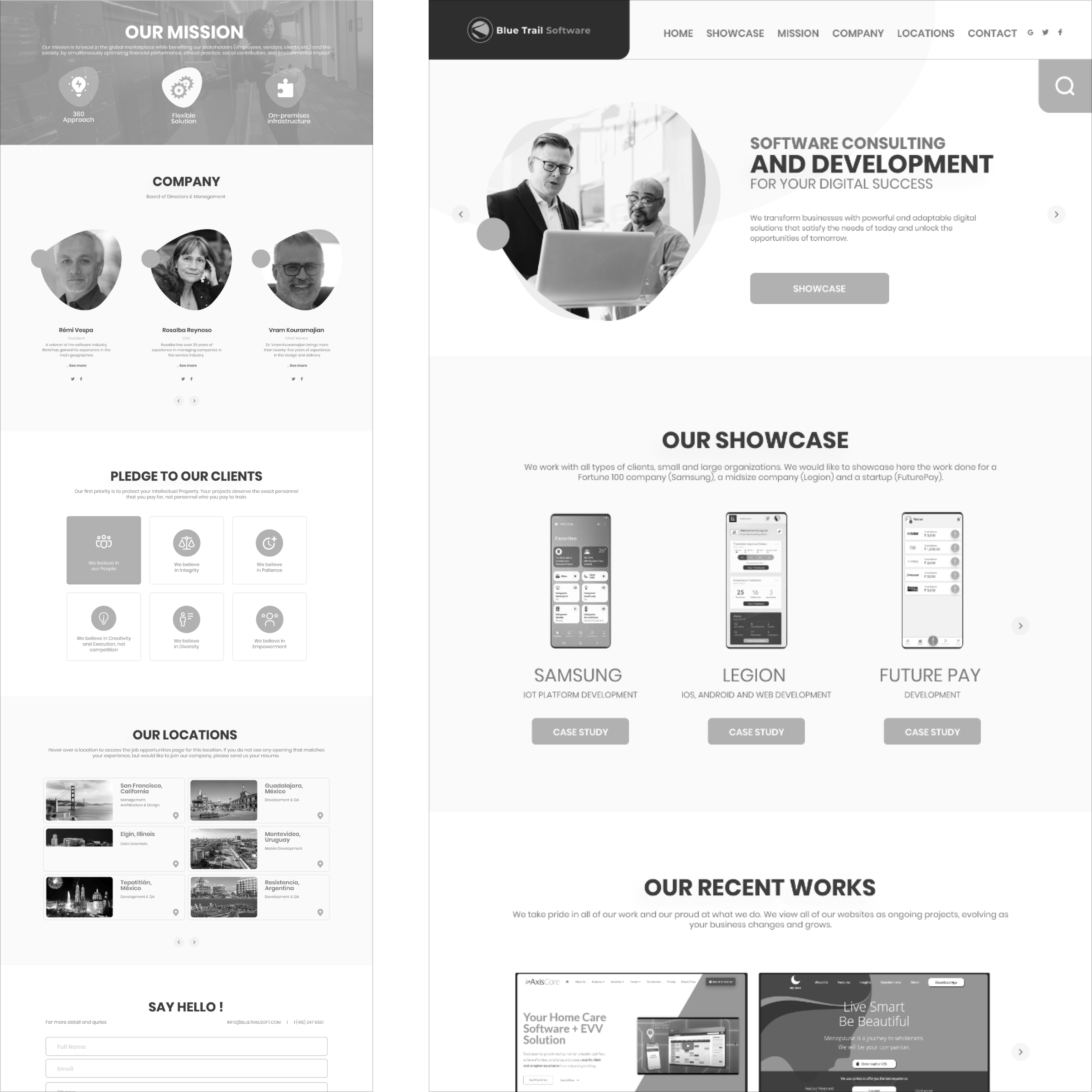
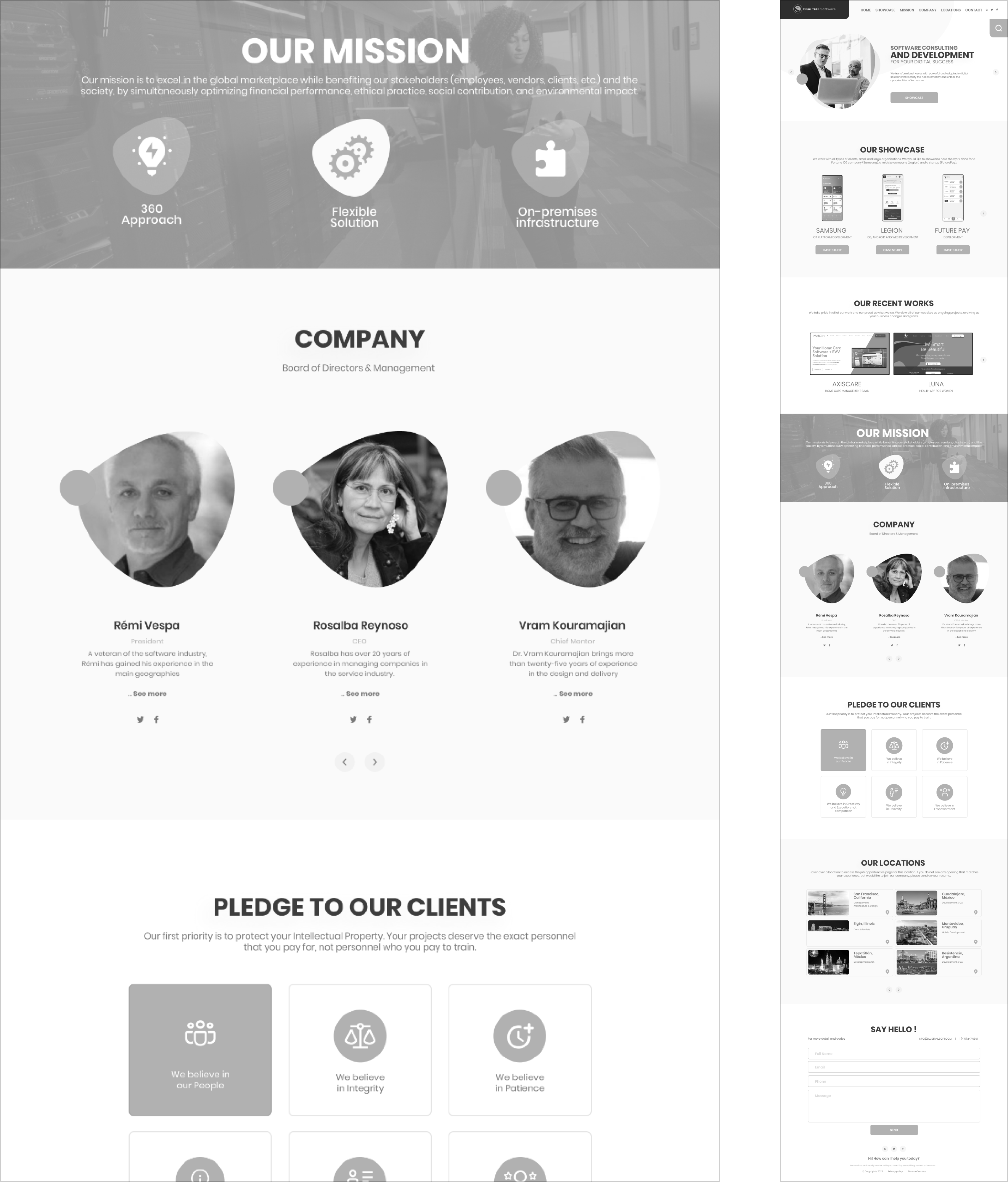
1. Enhance Form Accessibility: Simplify access to forms and processes for a seamless user experience.
2. Boost User Engagement: Emphasize key elements to enhance user engagement and interaction.
3. Optimize Turnaround Time: Achieve a 50% reduction in processing time while improving response rates.
4. Improve Site Navigation: Streamline site navigation for a smoother and more user-friendly journey.
5. Encourage Ongoing Involvement: Introduce a subscription-based approach to foster continuous user participation.
6. Enhance Decision-Making: site analytics for more informed decision-making.
7. Retain User Interest: Minimize exit points to maintain user interest and retention.
8. Modernize Visual Design: Refresh the visual aspects for a contemporary and appealing look.

Problem Statement

Our website experience needs improvement. Users find it difficult to navigate, encounter glitches in chat functions, and the design feels outdated. To boost engagement and satisfaction, we must prioritize enhancing functionality, stability, and aesthetics while adhering to industry standards.

Project Timeline

UI/UX Design Principles Applied

User Control & Freedom:

Users can interrupt and cancel downloads seamlessly.

Consistency & Standards:

Uniform design elements are maintained across all interfaces.

Efficiency of Use:

Tailored interactions for expert users to expedite tasks.

Minimalism:

Prioritizing essential information presented elegantly.

System Status Visibility:

Interactive navigation items highlight upon user interaction.

Guidance:

Leveraging toggle options for intuitive user navigation.

Usability Testing Findings

Chat Functionality: Enhance Chat Experience: Users seek improved reliability and efficiency in the chat feature, signaling the need for enhancements.

Response Time: Optimize Loading Speed: Address user dissatisfaction by ensuring a faster website loading time for a seamless experience.

Technical Glitches: Resolve Performance Issues: Users have observed occasional slowdowns and technical hitches, requiring attention for optimal functionality.

Visual Appeal: Modern UI Design: Feedback highlights a preference for a visually appealing, modern UI design to boost user engagement.
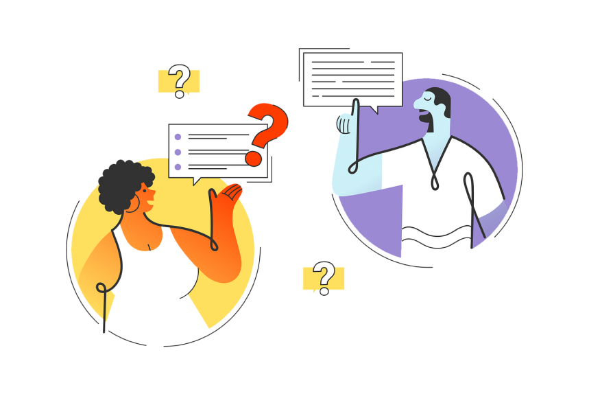
UX Audit & User Feedback

To understand the views of other users about our website, I’ve used the survey method for collecting data from the users world wide.

Question:
How satisfied are you with this new website design?

B.J Sims Said:
We have been very happy with the new website! It looks professional and is very easy to navigate. You handle things very efficiently and are available for any questions we have.

Question:
What kind of device do you use the most to access websites?

Brandon Said:
I spend too much time browsing the internet. I have an iPhone and a Fire Tablet that I use mainly. It seems we are moving toward a future in which our smartphones will be our only connection to the internet

Question:
What kind of difficulties do you face while browsing the website?

David Said:
Some websites loading time is too slow, When I browse something, I am facing an irritating popup with bad color combinations and designs. Unnecessary countdown timer for downloading and loading pages.

Question:
What are your thoughts on our new website?

Stan Said:
I honestly wouldn’t spend more than 5 seconds looking at your old website. It doesn’t seem professional or informative. But now, your new website looks nice with good relevant content.

Question:
What calls to action do you want on our website?

Merina Said:
Calls to action are requests you give your audience to perform a particular action. You put all of these on a right place.

Explore the Latest Industry UI Trends

Explore the Latest Industry UX Trends

Persona 1: John Smith

Name

John Smith

Occupation

Self-employed

Demographic

34 years old, lives in New York. Married with a 2-year-old child, has a middle-income level. He changed his occupation 3 years ago after getting married.

John’s Story

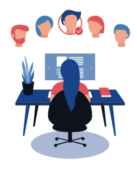
John was working for a global company and did not have much leisure time as his work was taking too much time. So, to start a family, he decided to quit his job and invest his savings in a bookshop, which has been his dream since his university years. All he wants to do is be able to maintain his bookshop.
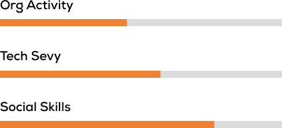
User Test

Needs
Improved design should be scaled according to mobile trends and they should properly rewrite the information and detail and try to fix all bugs.

Pain points
Actual Information is missing. The app is too old and is not properly scaled according to mobile view. I am facing some payment issues and an app crash.

Participant Demographics

Design Process & Implementation

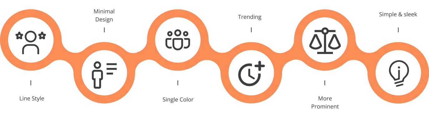
New Design Elements: Blend of Trends: Infused current design trends for a cohesive theme, emphasizing readability and visual appeal.

Navigation: Simplified Menus: Streamlined menus for enhanced focus and accessibility.

Visual Enhancements: Abstract Styles & High-Quality Images: Added abstract design elements and high-quality pictures for a more aesthetic experience.

Typography & Icons: Trendy Fonts & Minimalist Icons: Opted for modern typefaces and minimalist icons to elevate readability and visual engagement.
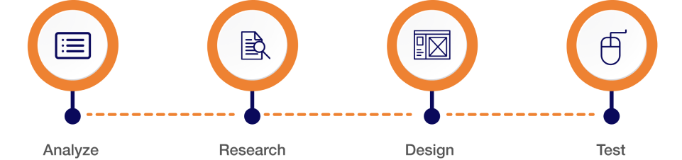
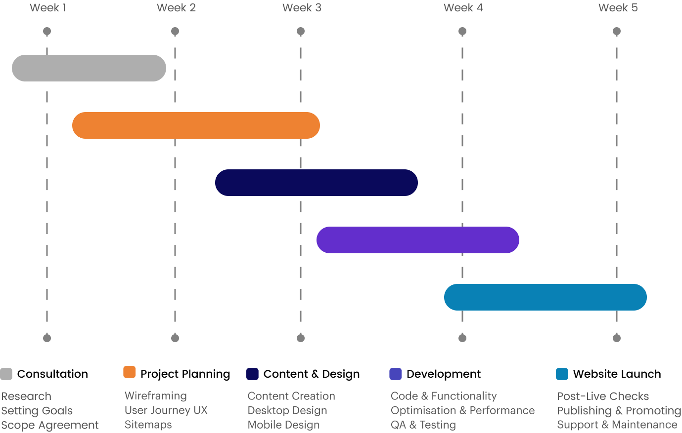
Sections with New Design Trends

All sections are designed according to new design trends with prominent theme colors and better readability.

Navigation

We are using a simple and prominent menu for better user focus and users can easily access their required page.

Current Images

Current images have old styled with shadows and it does not look good.

Better Visual

We added a better visual style. We add images into abstract style shapes.

Existing section

Existing colors and font are too large making content congested.

Improved Layout

With a new trending style we show this section in a new way.

Colors

Enhanced readability and design were achieved by refining the color palette to ensure a more cohesive and user-friendly experience, reducing excessive blue shades from the previous version.

Typography

Elevate your users’ experience with carefully curated fonts. Our selection includes advanced and trending options, ensuring a modern and engaging app interface.

Icons

Discover fresh and sleek icons. Our line icons seamlessly blend with any design style, offering timeless appeal. Stay on trend, adding a touch of visual allure to your experience.

UX Research & Action Plan

Challenges Addressed:
  • Streamlined Actions: Enhanced Call-to-Actions (CTAs) for a smoother user journey.
  • Simplified Submissions: Streamlined processes for effortless form submissions.
  • Improved Cookie Policy: Tailored policy to reduce bounce rates and boost user retention.
Strategies Implemented:
  • Informed Design: Utilized user recordings, heatmaps, and feedback for continuous design enhancements.
  • Customer-Centric Approach: Exceeded customer expectations through iterative improvements.

Action Plan

We used Recordings and Heatmaps to dig deeper into these UX research issues. The result was a gradual upgrade of the website to meet—and exceed—customer expectations. Here’s what happened:

  • We improved the visibility of CTAs with changes to font, color, and design. We also included a sharing widget to display social proof.
  • We removed the unnecessary content and congested areas with over lapping images.
  • We added HD high quality images on our all website / App.
  • We implemented design changes in the cookie policy pop-up to make it 30% bigger with better color and copy. They also placed the banner on the top of the page.

LoW FIDELITY

Showcased UI design improvements.

HIGH FIDELITY

Presented refined UI design screens with enhanced visuals and functionality.

thanks for watching

Have a project? Please inbox us.