
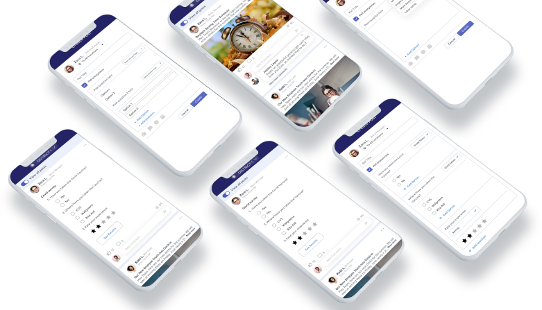

Improve chat capabilities:
Most of our users complain that “Your chat feature didn’t work.”
Some bankers and individuals ask “Why do you have a chat support service that doesn’t populate?
Login Issue:
User-facing login issues on the login page.
Recommendation:
A new login feature with biometrics and passcode has been added.
Apps Crashes:
“The user said, We are constantly being logged out and the app needs to be updated on again login.”
“Some users said that the app always crashes with a ”something went wrong” message.“
Recommendation:
We have added improved code and Bug fixes on the new release.
Technical glitches:
Some users say that the app crashes after they submit a payment every time. Leaves me uneasy
if payment went through and question if the app is secure.”
Recommendation:
Users want to be reassured their payment is successful and data is secure.
Multiple recipients:
Several users said the multiple-recipient option is not working properly.
“The app is a little confusing of knowing where to click to see how to add recipient in message box”
Question:
How satisfy are you with this new app design?
Carlos Said:
We have been very happy with new app design! It looks professional and very easy to navigate. You handle things very efficiently and are available for any questions we have.


Question:
What kind of device do you use the most to access app?
John Said:
I have an iPhone and a Fire Tablet that I use mainly. It seems we are moving toward a future in which our smartphones will be our only connection to the internet.
Question:
What kind of difficulties do you face while using apps?
Leslie Said:
Some apps loading time is too slow, When i browse something, I am facing an irritating popups with bad color combination and designs. Unnecessary count down timer for downloading and loading of pages.


Question:
What are your thoughts on our app?
Ben Said:
I honestly wouldn’t spend more than 1 minute looking at your old app structure. It doesn’t seem professional or informative. But now, your new app really looks nice with relevant content.
Question:
What calls to action do you want on app?
Guy Said:
Calls to action are requests you give your audience to perform a particular action. You put all of these on a right place.


User Control & Freedom:
User can Cancel a download before it completes.
Consistency & Standards:
We maintain the consistency in our all design.
Flexibility and Efficiency of Use:
We speed up the interaction for the expert user.

Minimalistic:
We are Providing only necessary information in an elegant way.

Visibility of System Status:
Navigation menu items set to underline when a user hovers over them.

Help Users:
We are using toggle options to guide user.
John was working for a global company and did not have much leisure time as his work was taking too much time. So, to start a family, he decided to quit his job and invest his savings in a bookshop, which has been his dream since his university years. All he wants to do is be able to maintain his bookshop.
Needs
Improved design should be scale according to mobile trend and they should rewrite the information and detail in a proper way and try to fix all bugs.
Pain points
Actual Information is missing. App is too old and is not proper scale according to mobile view. I am facing some payment issues and app crashes.


Challenge
The founder of the website wanted to optimize their website experience by improving three problem areas:
Action Plan
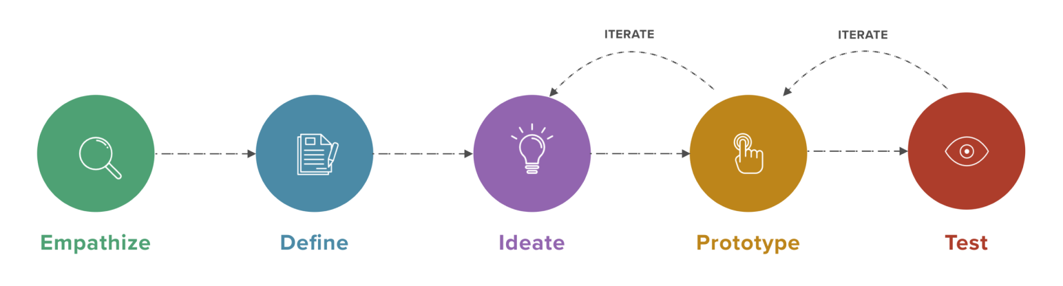
We used Recordings and Heatmaps to dig deeper into these UX research issues. The result was a gradual upgrade of the website to meet—and exceed—customer expectations. Here’s what happened:
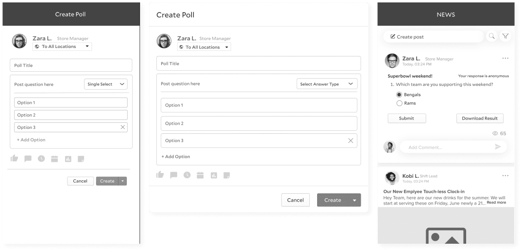
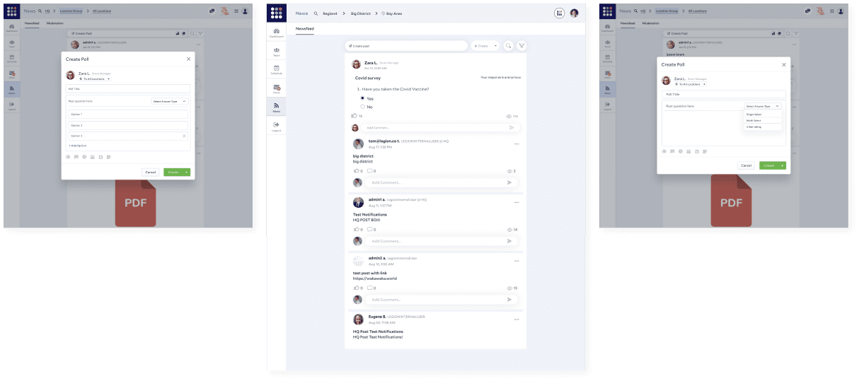

Prototype Development: Created prototypes for web and mobile surveys, ensuring compatibility and user-friendliness.
Testing: Collaborated with iOS and Android engineers to review designs and user flows, ensuring seamless functionality.
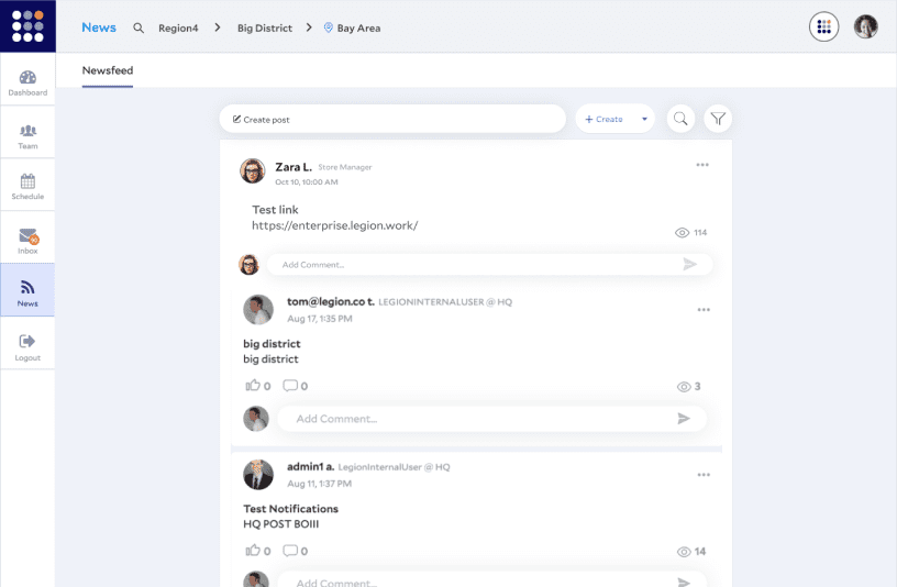
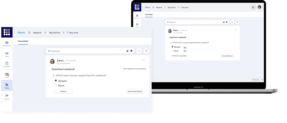
Sharing vision and values ( Bold). Legion and Philz shared a vision to create a platform that enabled employees to work wherever and whenever they wanted while still meeting the needs of the business.
Managers previously had no visibility of the other locations their employees wanted to work at. Allowing users to add other preferred working locations created a system that the entire business could track, regardless of location.
Employees had more flexibility and the potential to earn more and help out other stores. Managers could utilize a greater-sized team when trying to fill gaps in the schedule.