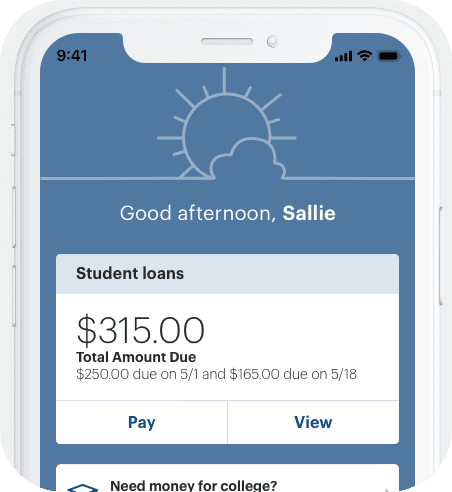
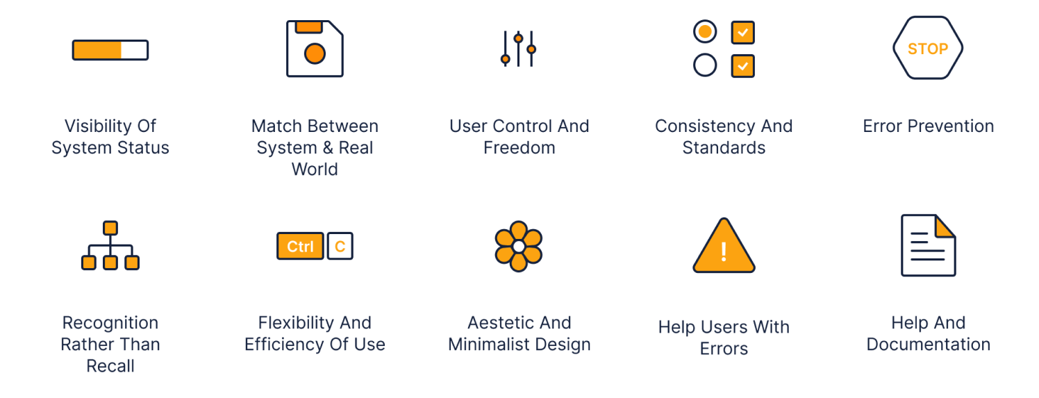
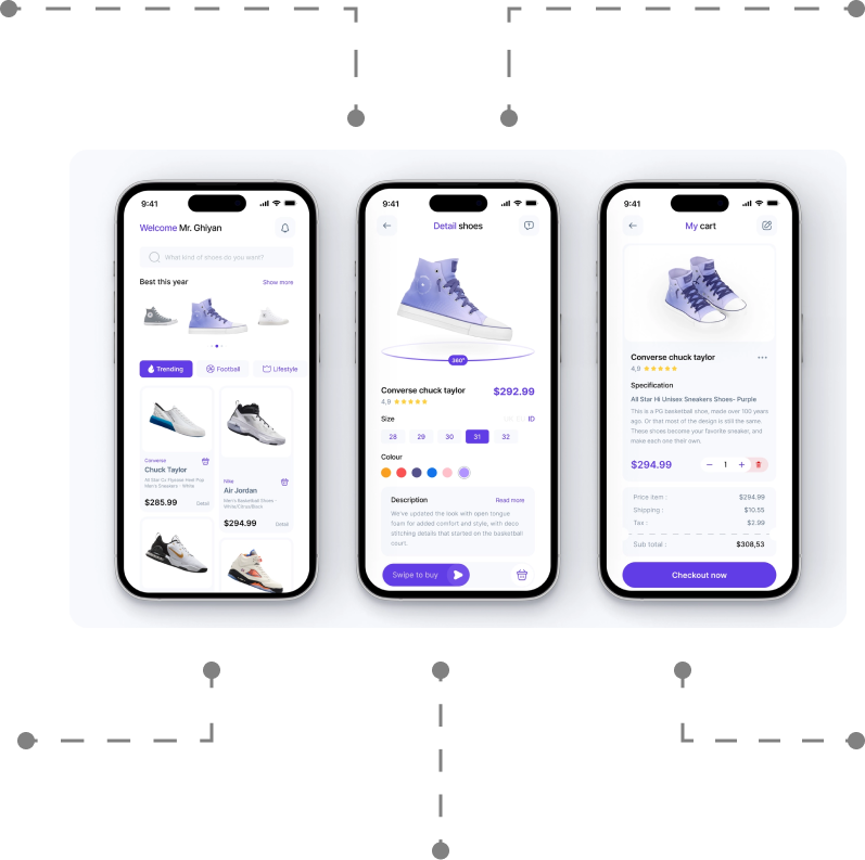
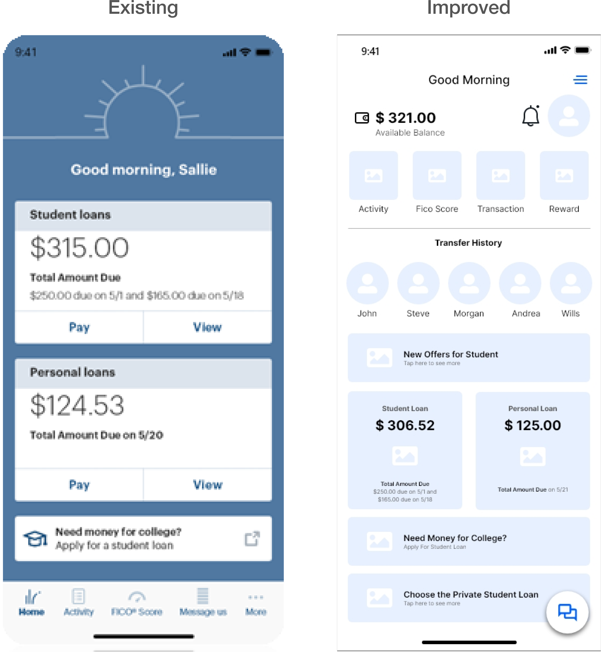
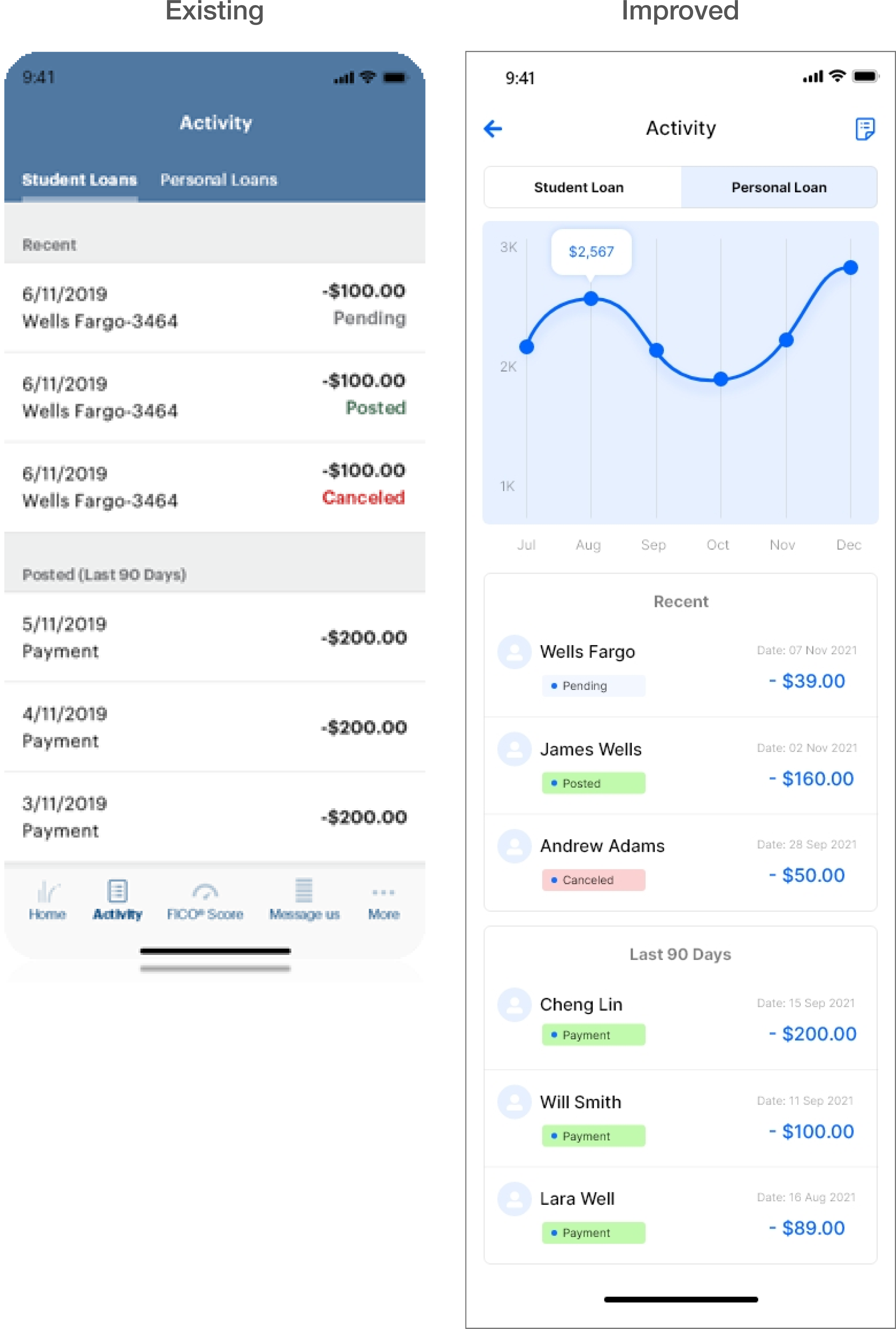
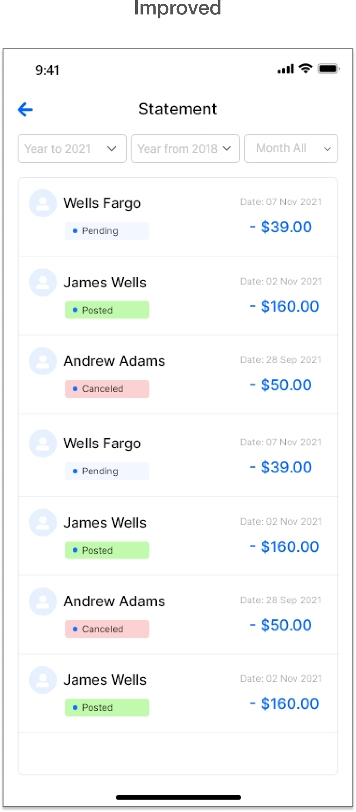
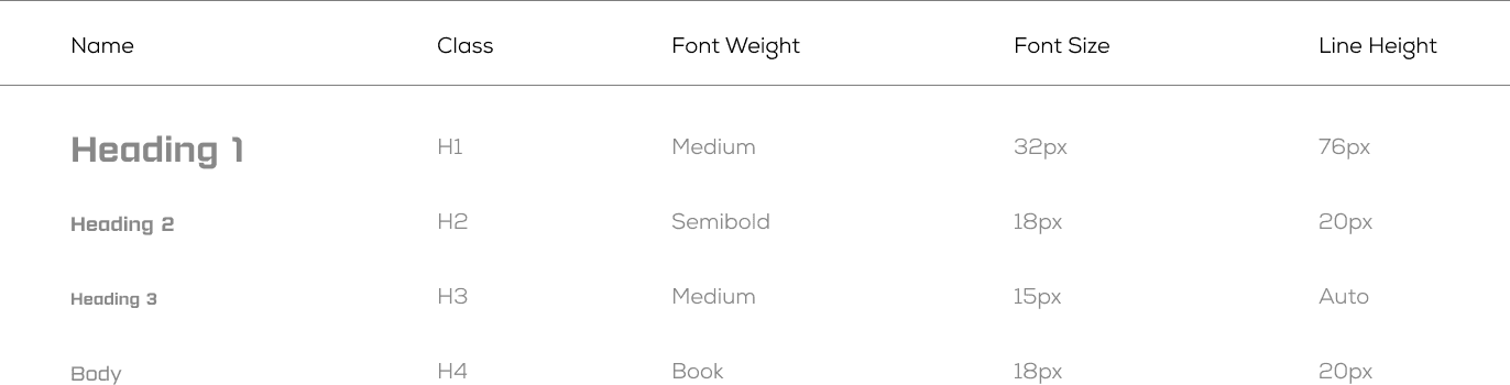
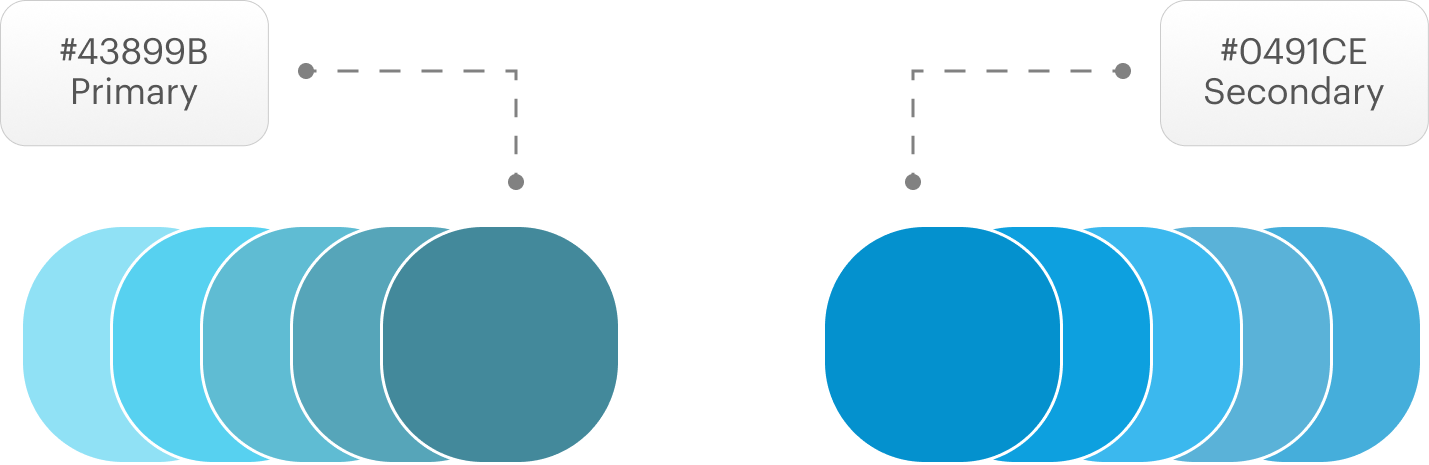
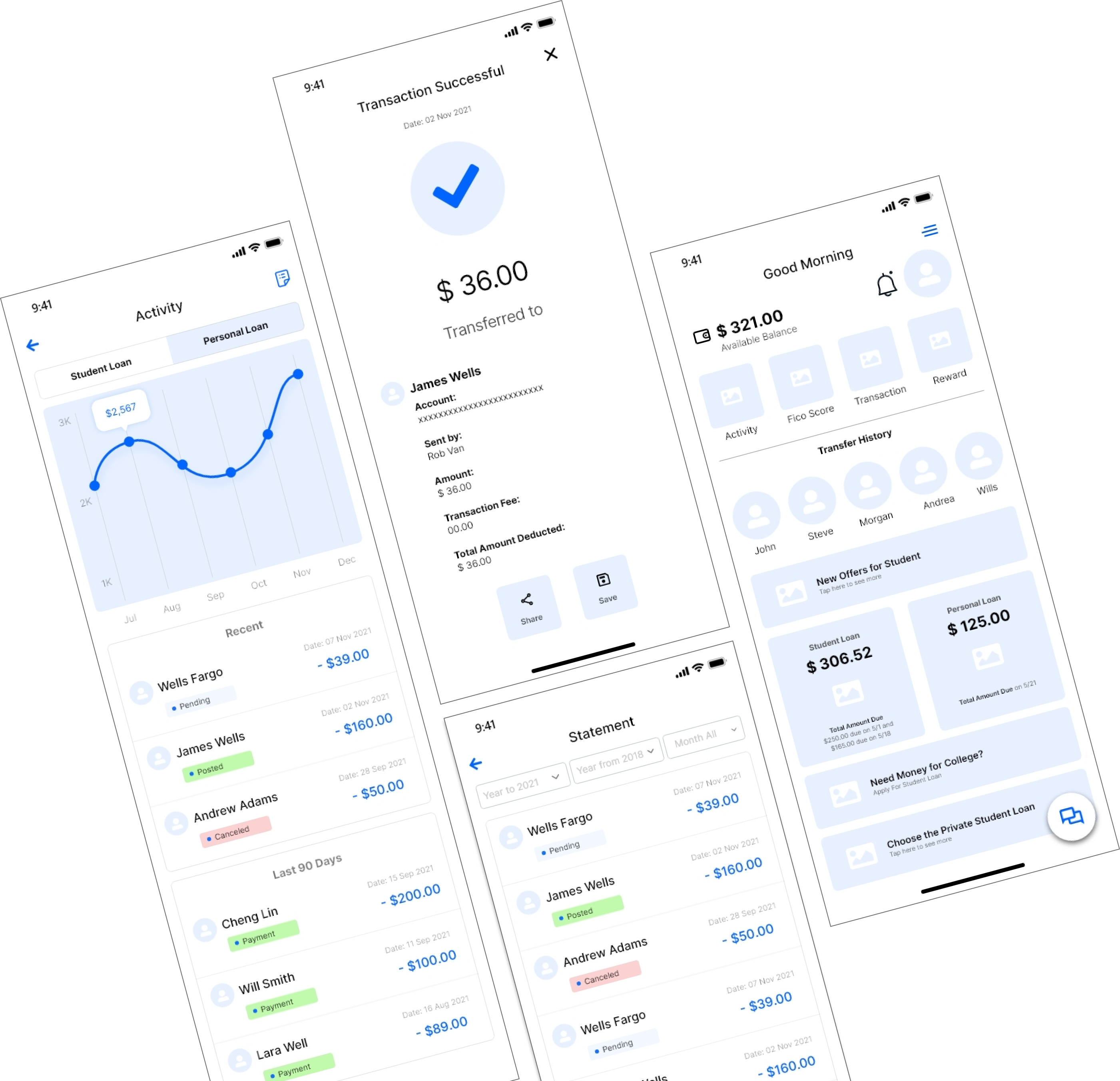
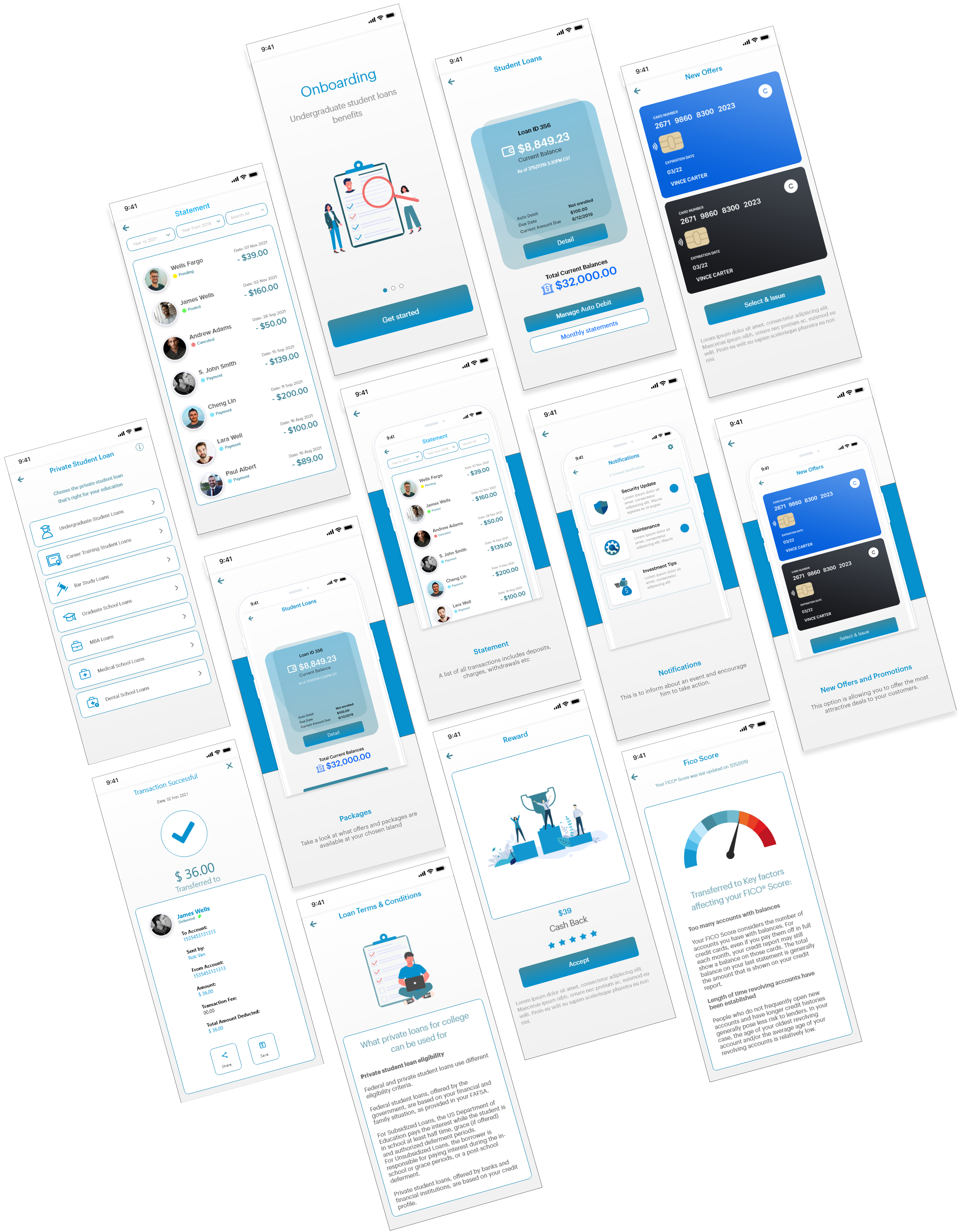
Improve chat capabilities:
Most of our users complain that “Your chat feature didn’t work.”
Some bankers and individuals ask “Why do you have a chat support service that doesn’t populate?
Recommendation:
Users want enhancements and reliability with chat functionality.
So, It would be helpful if it worked so I wouldn’t have to call in for simple fixes.”
Login Issue:
User-facing login issues on the login page.
Recommendation:
A new login feature with biometrics and passcode has been added.
Apps Crashes:
“The user said, We are constantly being logged out and the app needs to be updated on again log in.”
“Some users said that the app always crashes with a ”something went wrong” message.“
Recommendation:
We have added improved code and Bug fixes on the new release.
Technical glitches:
Some users say that the app crashes after they submit a payment every time. Leaves me uneasy if payment went through and questions if the app is secure.”
Show payoff amount:
Most users said, “In the app, it is not showing the actual display, true full-payoff amount.”
Another user suggested, “It would be nice that when someone is paying off a student loan there could be an option to just pay it off.”
Recommendation:
Users would like more transparency when it comes to paying off their loan(s).
Banking customers are becoming digital-savvy. Born in the digital era, younger consumers have a high standard when it comes to mobile experience. Delivering a robust and engaging digital banking solution is essential to keep them coming back to it and even recommending it to their friends.
Unfortunately, many fintech apps fail at UX. According to a Bain and Company study, only 8% of consumers agree that most fintech apps deliver a great customer experience.
Here are some key UX trends that can help you achieve this. While this list is for fintech websites, it’s relevant to apps as well:
We highlight that simple actions can get you 5x or more results. This is especially true for user onboarding. So we don’t overwhelm our audience from the start, we keep our onboarding as simple as we can.
For example, in a money transfer system, customers need to have an active SIM card and an email address. To ensure security, customers are required to confirm their phone number and email. Finally, users create a 4-digit password or activate Touch ID/Face ID to log into the account. While using the app, customers should follow only 4 steps.
Visibility: Keep users informed about system status and what’s happening.
Mapping: User-familiar concepts and language.
Freedom: Provide good defaults and undo options.
Consistency: Use the same interface and language throughout.
Error Prevention: Help users avoid making mistakes.
Recognition: Avoid making users remember information. Make elements and actions visible.
Minimalism: Elegantly provide only necessary information.
Flexibility: Provide only necessary information elegantly.
Error recovery: Help users recognize, diagnose, and recover from errors.
Help: User proactive and in-place hints to guide users.
Minimalistic icons: Forward-thinking innovators in the App design space have been to take ‘minimal design
Typography Trends: Novelty fonts and towards type that is more honest, legible, and inclusive.
Dark Colors: Gradients can blend or transition similar colors.
Rounded Corner: They allow our eyes to easily follow the lines as curves are better suited to the natural movement of the head and eyes.
Gradients: The gradient trend is extremely versatile.
Data Visualization: Graphical representation of information and data. By using visual elements like charts, graphs, and maps.
User Control & Freedom:
User can Cancel a download before it completes.
Consistency & Standards:
We maintain the consistency in our all design.
Flexibility and Efficiency of Use:
We speed up the interaction for the expert user.
Minimalistic:
We are Providing only necessary information in an elegant way.
Visibility of System Status:
Navigation menu items set to underline when a user hovers over them.
Help Users:
We are using toggle options to guide user.
Sales Manager include hiring, training, and providing professional development for their teams and setting weekly, monthly, or quarterly goals based on the team’s performance to date.
On this screen:
An old graphical image welcoming the user. Only 2 to 3 options were displayed on the screen. A lack of information is provided on screen.
Recommendation:
In this activity screen:
An old tab style was a part of this screen, no any interactive graph and statics was displayed on screen.
Recommendation:
In this Statement screen:
On the existing screen, there were no filter options and the list was very congested.
Recommendation:
A low-fiedlity mockup is intentionally basic so you can focus on design and flow rather than intricate details. These designs can be created on just about anything—a napkin, graph paper, a whiteboard, or a digital, visual workspace.
Question:
How satisfy are you with this new app design?
Christina Said:
We have been very happy with new app design! It looks professional and very easy to navigate. You handle things very efficiently and are available for any questions we have.
Question:
What kind of device do you use the most to access app?
Crystal Said:
I have an iPhone and a Fire Tablet that I use mainly. It seems we are moving toward a future in which our smartphones will be our only connection to the internet.
Question:
What kind of difficulties do you face while using apps?
Elaine Said:
Some apps loading time is too slow, When i browse something, I am facing an irritating popups with bad color combination and designs. Unnecessary count down timer for downloading and loading of pages.
Question:
What are your thoughts on our app?
Albert Said:
I honestly wouldn’t spend more than 1 minute looking at your old app structure. It doesn’t seem professional or informative. But now, your new app really looks nice with relevant content.
Question:
What calls to action do you want on app?
Stone Said:
Calls to action are requests you give your audience to perform a particular action. You put all of these on a right place.