UX AUDIT

PURPOSE

The purpose of this document is to report on the findings and recommendations from iterative UX audits of the “Champion Health and Wellness” and related user interfaces.
The goal of these audits is to identify website user experience and usability issues, and provide actionable recommendations to solve them.
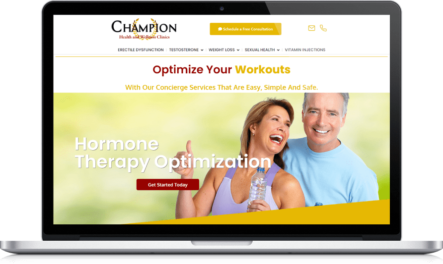
PURPOSE

The purpose of this document is to report on the findings and recommendations from iterative UX audits of the “Champion Health and Wellness” and related user interfaces.

The goal of these audits is to identify website user experience and usability issues, and provide actionable recommendations to solve them.

Process

List of issues

Currently identified UX Issues can be summarized into the following main issues:

List Of Problems

List of issues

Currently identified UX Issues can be summarized into the following main issues:

List Of Problems

Findings and recommendations

Lack of User Onboarding
There is no onboarding whatsoever.

Recommendation
Improve Product page table usability by adopting proven design patterns. Improved onboarding and help/support resources shall help manage user expectations.

Findings and recommendations

Lack of User Onboarding
There is no onboarding whatsoever.

Recommendation
Improve Product page table usability by adopting proven design patterns. Improved onboarding and help/support resources shall help manage user expectations.

Accessibility check

Elements with a poor contrast ratio

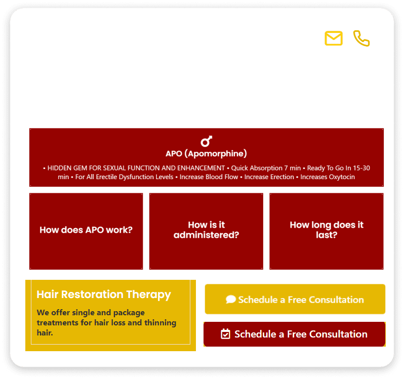
Low-contrast text is difficult or impossible for many users to read. The elements shown below do not meet the AA or the AAA standard requirements.

  • To much bold text used on all pages
  • To many dark colors used
  • Alignment & Spacing issue

Common accessibility best practices

The attributes on the page are not unique. The value of an id attribute must be unique to prevent other instances from being overlooked by assistive technologies.
  • Use bright trending colors
  • Make sure the alignment should be correct
  • Body text should be in regular format

Accessibility check

Elements with a poor contrast ratio

Low-contrast text is difficult or impossible for many users to read. The elements shown below do not meet the AA or the AAA standard requirements.

  • To much bold text used on all pages
  • To many dark colors used
  • Alignment & Spacing issue

Common accessibility best practices

The attributes on the page are not unique. The value of an id attribute must be unique to prevent other instances from being overlooked by assistive technologies.

  • Use bright trending colors
  • Make sure the alignment should be correct
  • Body text should be in regular format

make it prominent

Issue
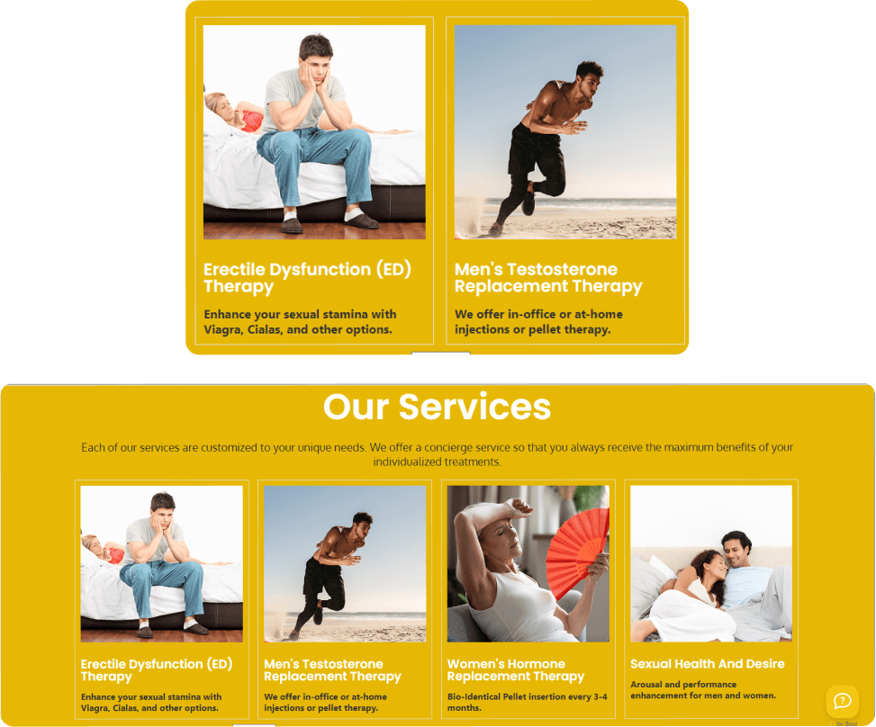
  • Bold and dark colors kill the visibility of text.
  • Color contrast is not looking good.
  • Congested text in boxes
Recommendation
  • Bright Colors
  • Make it Simple
  • Clear Text
  • Increase Spaces between images and boxes

make it prominent

Issue
  • Bold and dark colors kill the visibility of text.
  • Color contrast is not looking good.
  • Congested text in boxes
Recommendation
  • Bright Colors
  • Make it Simple
  • Clear Text
  • Increase Spaces between images and boxes

Unattractive headers

Issue
  • Overlapped Text
  • Too much large image
Recommendation
  • Make it more eye-catching
  • Make it Simple
  • Slider should be used

Unattractive headers

Issue
  • Overlapped Text
  • Too much large image
Recommendation
  • Make it more eye-catching
  • Make it Simple
  • Slider should be used

Forms design

Issue
  • Contact details are missing
  • Social media platform links are missing
  • Consultant form is not aligned properly and missing their look
Recommendation
  • Detailed separated contact page required
  • Social media links should be published
  • An instant contact form should be used
  • Consultant form should be designed in a proper way

Ahead of the action

Study. Plan. Question. Create. Implement. Understand. Question. Pivot. Implement. Create.

Discovery

This deep dive into who you are and who you could drive everything else that we build together.

Implementation

It’s in the implementation phase that everything comes to life and starts working for you.

Strategy and Planning

If discovery tells us where to go, strategy is the map that gets us there.

Messaging and Creative

To have pointed, poignant creativity, it must be rooted in strategic thinking and insight.

What Could be done

1. Improve website navigation.
2. Create a general style for the website.
3. Make it possible to search all information on the website.
4. Add tips to the user to prevent mistakes.
5. Revised Structure.

What Could be done

1. Improve website navigation.
2. Create a general style for the website.
3. Make it possible to search all information on the website.
4. Add tips to the user to prevent mistakes.
5. Revised Structure.

THANK YOU
We are here to help you