AI-powered SaaS & Desktop Application

Safe space to engage with

Complex DEIB

AI-powered SaaS & Desktop Application

Safe space to engage with

Complex DEIB

The Solution

Creating and using dashboards effectively can be challenging, but overcoming these common issues will help you provide valuable insights for your organization.
  • Prioritize the most important metrics: Focus on the key performance indicators (KPIs) that are most relevant to your business objectives.
  • Group-related data: Use sections or tabs to organize similar metrics, making it easier to analyze and understand the data.
  • Visual suggestion: Use clear headings, borders, or whitespace to separate different sections or groups of data.
  • Visual suggestion: Use tooltips, annotations, or labels to provide context directly on the chart or graph.

Project Timeline

Benefits

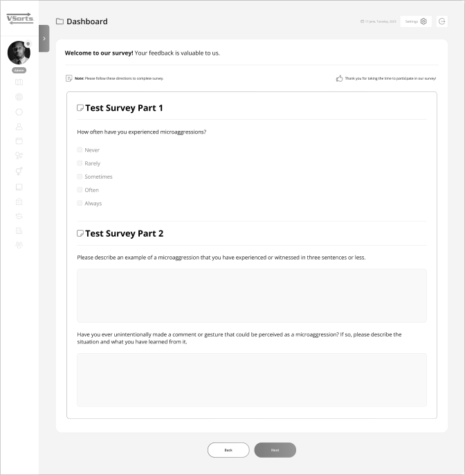
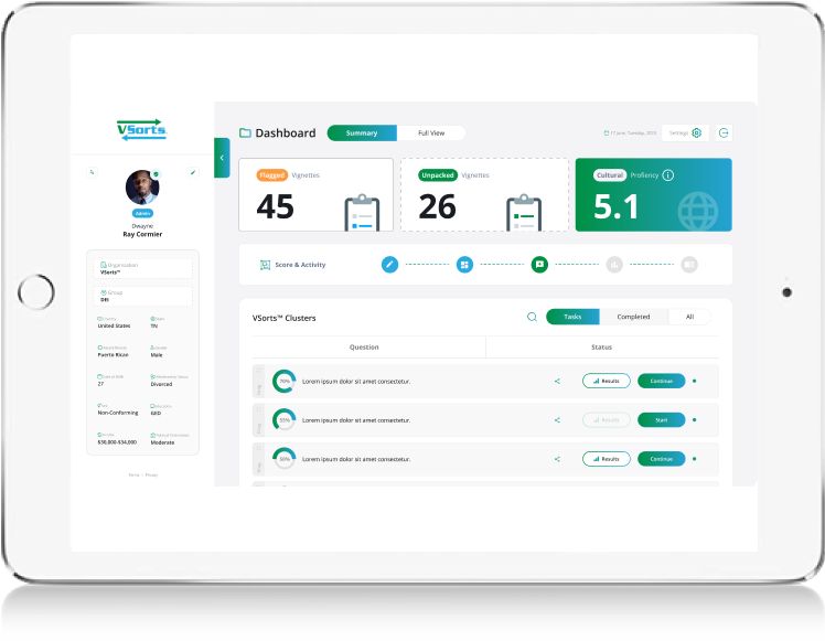
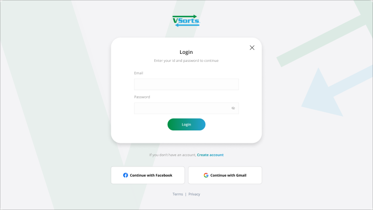
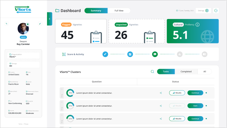
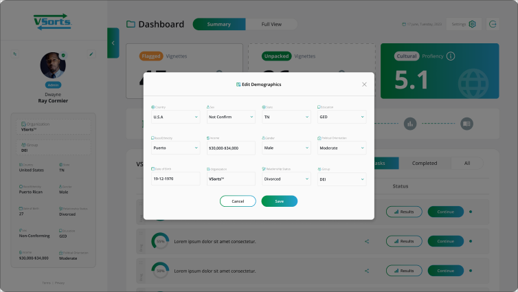
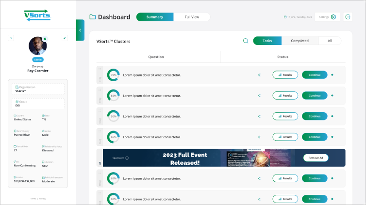
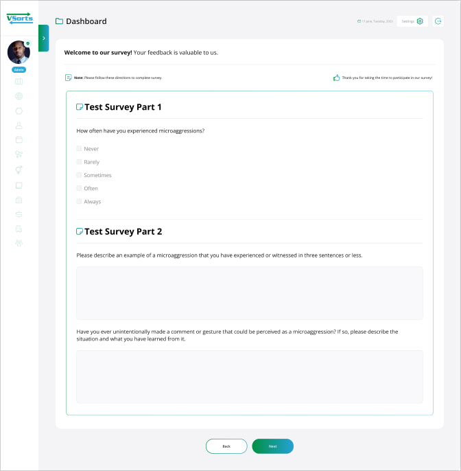
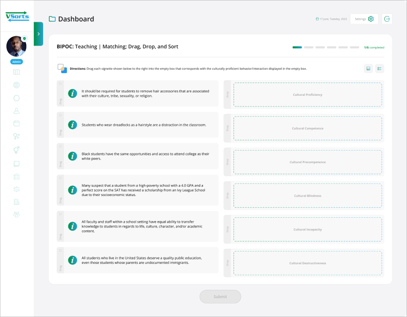
It simplifies the creation and distribution of surveys, aids in collecting valuable insights, and helps you make data-driven decisions. Its user-friendly interface and powerful analytical tools make the user experience rewarding. The software is designed to be versatile, and thus, it will adapt to the growing needs of your business.

Usability Heuristics

User Control & Freedom:

User can Cancel a download before it completes.

Consistency & Standards:

We maintain the consistency in our all design.

Flexibility and Efficiency of Use:

We speed up the interaction for the expert user.

Minimalistic:

We are Providing only necessary information in an elegant way.

Visibility of System Status:

Navigation menu items set to underline when a user hovers over them.

Help Users:

We are using toggle options to guide user.

Usability testing

Improve chat capabilities:
Most of our users complain that “Your chat feature didn’t work.”
Some bankers and individuals ask “Why do you have a chat support service that doesn’t populate?

Response Rate:
User facing slow response rate.
Recommendation:
Users want to load the website smoothly.
Technical glitches:
Some users tell about the slowdown of the website.
Recommendation:
Users want to load every page smoothly.
Low End Graphics:
Several users tell us, the UI of this website is too old and is not attractive.
Recommendation:
Users want to load every page smoothly.

UX Audit

To understand the views of other users about our website, I’ve used the survey method for collecting data from users worldwide.

Question:
How satisfy are you with this new website design?

Frank J. Said:
We have been very happy with new website! It looks professional and very easy to navigate. You handle things very efficiently and are available for any questions we have.

Question:
What kind of device do you use the most to access websites?

Brandon Said:
I spend too much time browsing the internet. I have an iPhone and a Fire Tablet that I use mainly. It seems we are moving toward a future in which our smartphones will be our only connection to the internet

Question:
What kind of difficulties do you face while browsing website?

David Said:
Some websites loading time is too slow, When i browse something, I am facing an irritating popups with bad color combination and designs. Unnecessary count down timer for downloading and loading of pages.

Question:
What are your thoughts on our new website?

Stan Said:
I honestly wouldn’t spend more than 5 seconds looking at your old website. It doesn’t seem professional or informative. But now, your new website really looks nice with good relevant content.

Question:
What calls to action do you want on our website?

Merina Said:
Calls to action are requests you give your audience to perform a particular action. You put all of these on a right place.

Persona 1: James Oliver

Name

John Smith

Occupation

Self-employed

Demographic

34 years old, lives in New York. Married with a 2-year-old child, has a middle-income level. He changed his occupation 3 years ago after getting married.

John’s Story

James was working for a global company and did not have much leisure time as his work was taking too much time. So, to start a family, he decided to quit his job and invest his savings in a bookshop, which has been his dream since his university years. All he wants to do is be able to maintain his bookshop.

User Test

Needs
Improved design should be scale according to mobile trend and they should rewrite the information and detail in a proper way and try to fix all bugs.

Pain points
Actual Information is missing. Web is too old and is not proper scale according to mobile view.

Participant Demographics

Design Process

Existing Screen

UX Research

Challenge

The founder of the website wanted to optimize their website experience by improving three problem areas:

  • Poorly placed calls to action (CTAs), where mobile users couldn’t see the CTA enough to click on it
  • Customer drop-offs at any submission and processing step because users wanted to smooth responses on time.
  • A complicated cookie policy that caused visitors to bounce as soon as they landed on the website.

Action Plan

We used Recordings and Heatmaps to dig deeper into these UX research issues. The result was a gradual upgrade of the website to meet—and exceed—customer expectations. Here’s what happened:

  • We improved the visibility of CTAs with changes to font, color, and design. We also included a sharing widget to display social proof.
  • We removed the unnecessary content and congested areas with overlapping images.
  • We added HD high-quality images on our all websites / Apps.
  • We implemented design changes in the cookie policy pop-up to make it 30% bigger with better color and copy.

Logo Variations

  • A logo variation is a version of your primary logo, just re-arranged in a different format, sometimes referred to as your secondary logo.

Minimum Size

The registered trademark symbol should be on the logo every time used. The relationship between the a and the logo is relative to maintaining legibility in all sizes. The scale is separate from the logo when it appears smaller than 60 px tall. At sizes smaller than 60 px tall, the • will always be 5 px tall. At sizes larger than 60px, (this ratio is reflected in the standard logo files available to employees and partners).

Typography

Open Sans is an open source humanist sans-serif typeface that was designed by Steve Matteson under commission from Google. It was released in 2011 and is based on his earlier design called Droid Sans, which was specifically created for Android mobile devices but with slight modifications to its width.

Low Fidelity Mockups

High Fidelity Designs and Prototype

User Interface (UI) Design focuses on anticipating what users might need to do and ensuring that the interface has elements that are easy to access, understand, and use to facilitate those actions. UI brings together concepts from interaction design, visual design, and information architecture.

We use primary colours to a modern mix of green and blue, plus all-new photography. We utilized new sharpe images , combined with Open Sans typography against Simple white space.

Thank You