Develop a user-centric website for a pediatric dental clinic, encompassing clinic details, services, appointment bookings, and patient education. Emphasis on a visually captivating, user-friendly, and universally accessible design.
Project Goal
Craft an intuitive website layout that prioritizes user ease, houses comprehensive information, and embodies a modern, innovative aesthetic.
Project Overview
Develop a user-centric website for a pediatric dental clinic, encompassing clinic details, services, appointment bookings, and patient education. Emphasis on a visually captivating, user-friendly, and universally accessible design.
Project Goal
Craft an intuitive website layout that prioritizes user ease, houses comprehensive information, and embodies a modern, innovative aesthetic.
Problem Statement
Address challenges like elevated exit rates, suboptimal design, diminished search visibility, mobile incompatibility, page malfunctions, prolonged loading durations, and security vulnerabilities.
High exit rates.
Poor web design.
Low search ranking.
Mobile incompatibility.
Broken pages and redirects.
Slow loading times.
Inaccessible contact information.
Security breaches and vulnerabilities.
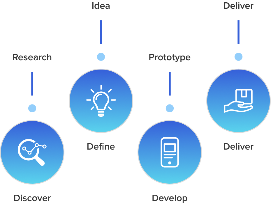
Design Process
The website aims to be the pivotal information hub for students and stakeholders, spotlighting event schedules, keynote speakers, participating teams, and project insights.
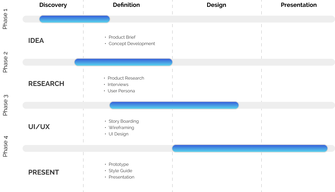
Project Timeline
Biography
Sales Manager include hiring, training, and providing professional development for their teams and setting weekly, monthly, or quarterly goals based on the team’s performance to date.
Bryne Adams
“Don’t worry about how you should draw it, Just draw it the way you see it.”
Goals & Need
Provide powerful reports and insights to all roles.
Centralize your 360-degree evaluation process.
The product is easy to use and integrates with existing platforms.
Organization
2
Age
28 Years
Location
Washimgton
Occupation
Sales Manager
Frustration
Lack of clarity
A person shouldn’t have to think very hard about where to go next.
User Flow
We create it to show you the big picture and understand how users navigate a website or app. User flows are typically shown using diagrams, wireframes, prototypes, flowcharts, and other tools.
Design system
UI Design prioritizes user needs, ensuring accessible, understandable, and efficient interface elements by amalgamating interaction design, visual aesthetics, and information architecture.
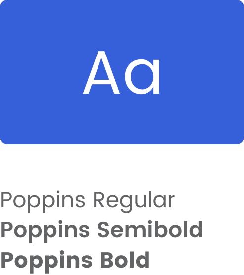
TYPOGRAPHY - POPPINS
Poppins, conceptualized by the Indian Type Foundry, blends traditional geometric font aesthetics with Devanagari script nuances. Its versatility spans display to text formats, offering nine weight variations, each complemented by italics.
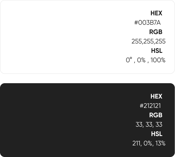
Colors
COLORS & TRENDS
Smart Content Load for a More Enjoyable User Experience
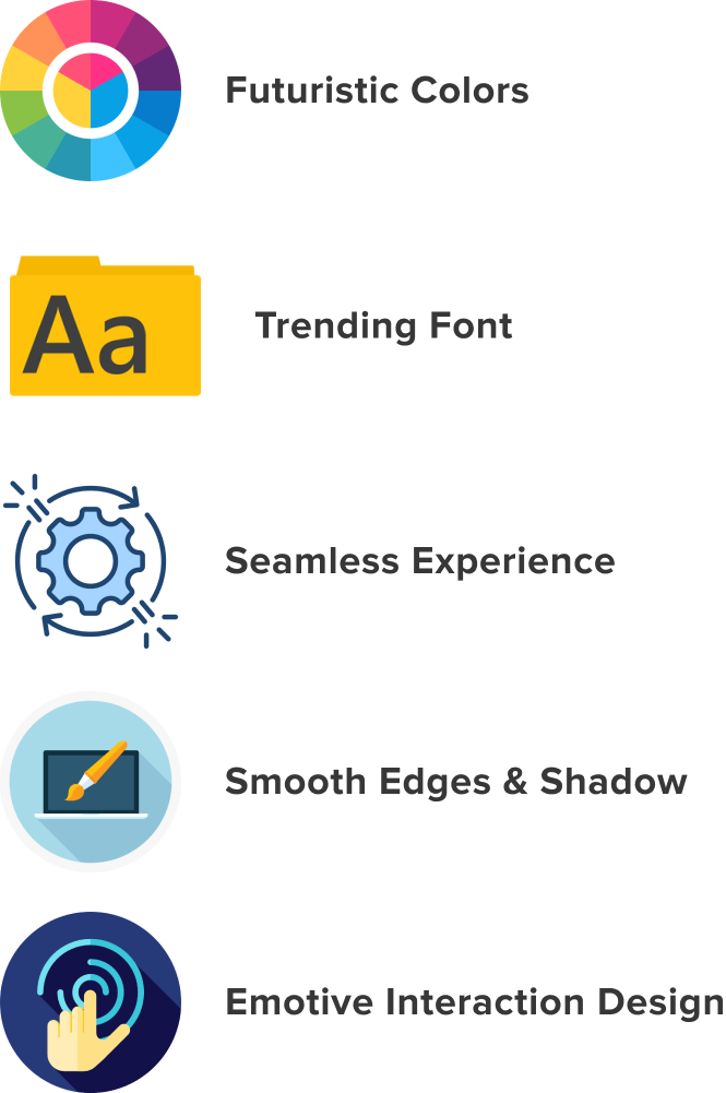
Current Trends
Smart content loading
Rounded shapes
Animated elements
Minimalistic icons
Clean, purposeful spacing
Dynamic visuals
Conversational design
IDENTIFYING OUTDATED DESIGN
Recognize signs of an outdated website: unclear navigation, archaic fonts, repetitive imagery, irrelevant design motifs, suboptimal mobile optimization, and diminished user experience. Prioritize redesigning for relevance and efficiency.
Bright backgrounds, old-fashioned fonts, and typeface too small for reading are all signs that your website is outdated. If this is the case, it’s time for a new, modern design.
There’s no clear path
Outdated design
Overused stock images and icons
Design for the wrong reasons
Cute that doesn’t cut it
The site isn’t optimized for mobile
Play hard to get
Poor user experience
New Screen
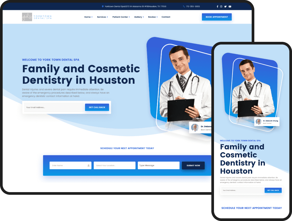
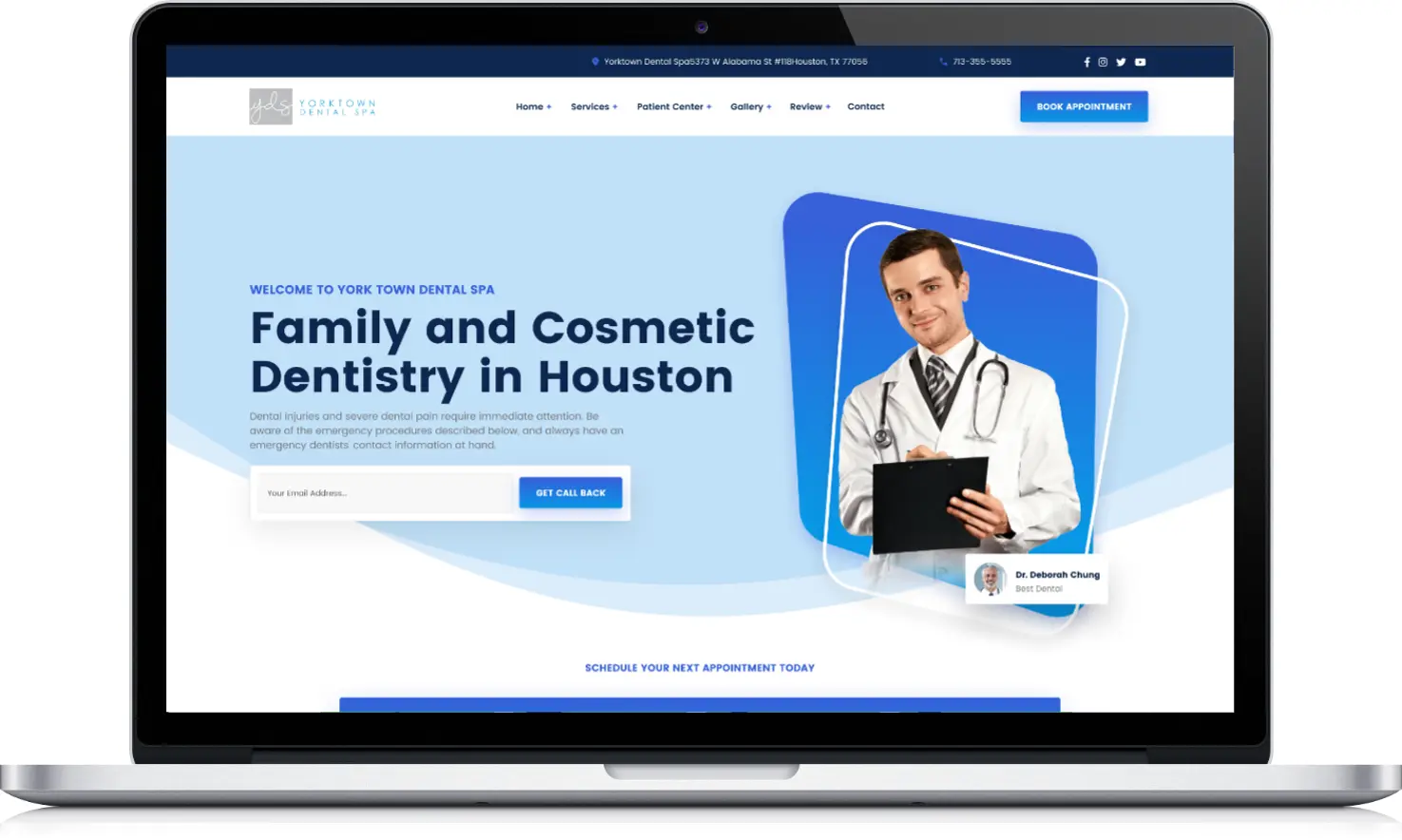
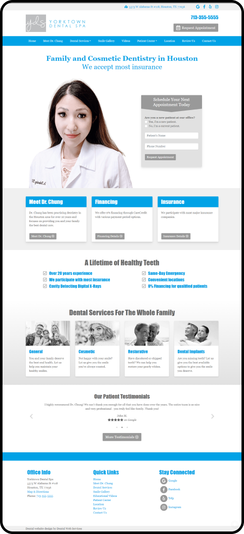
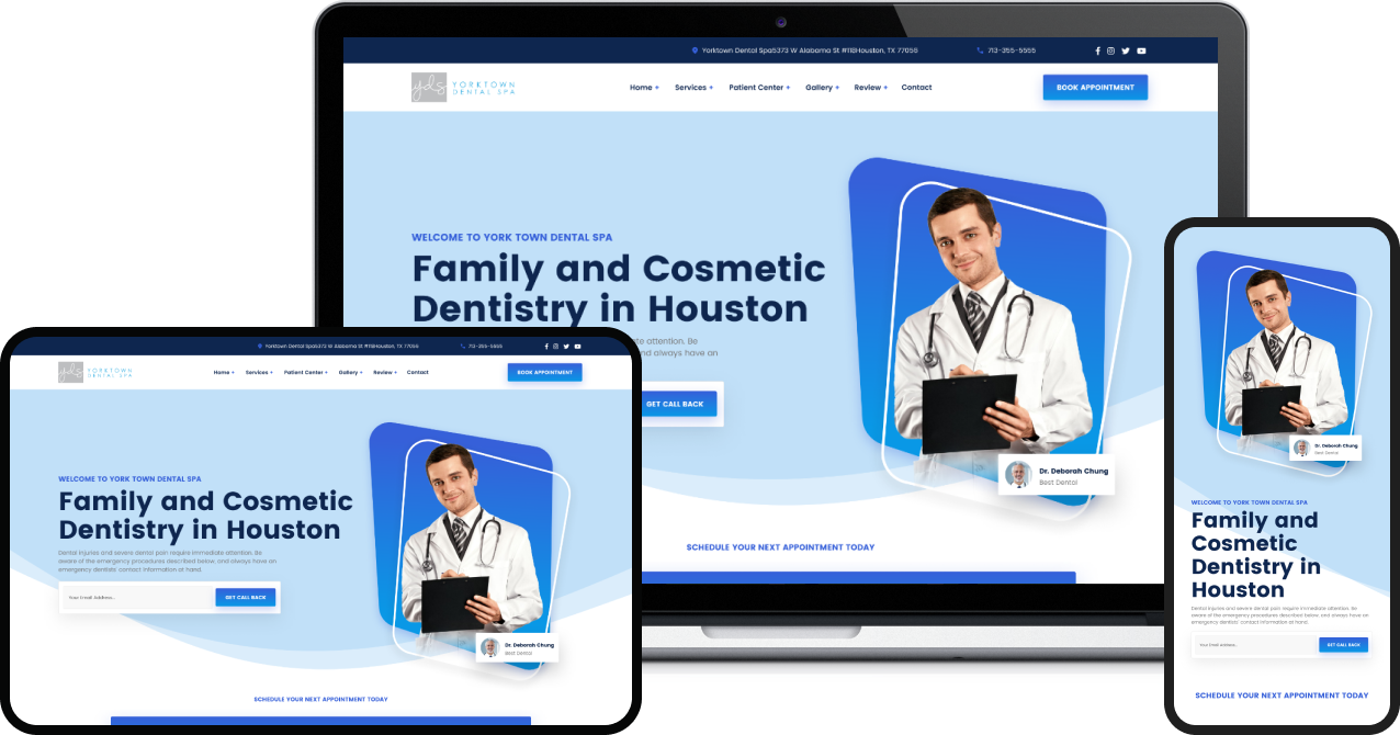
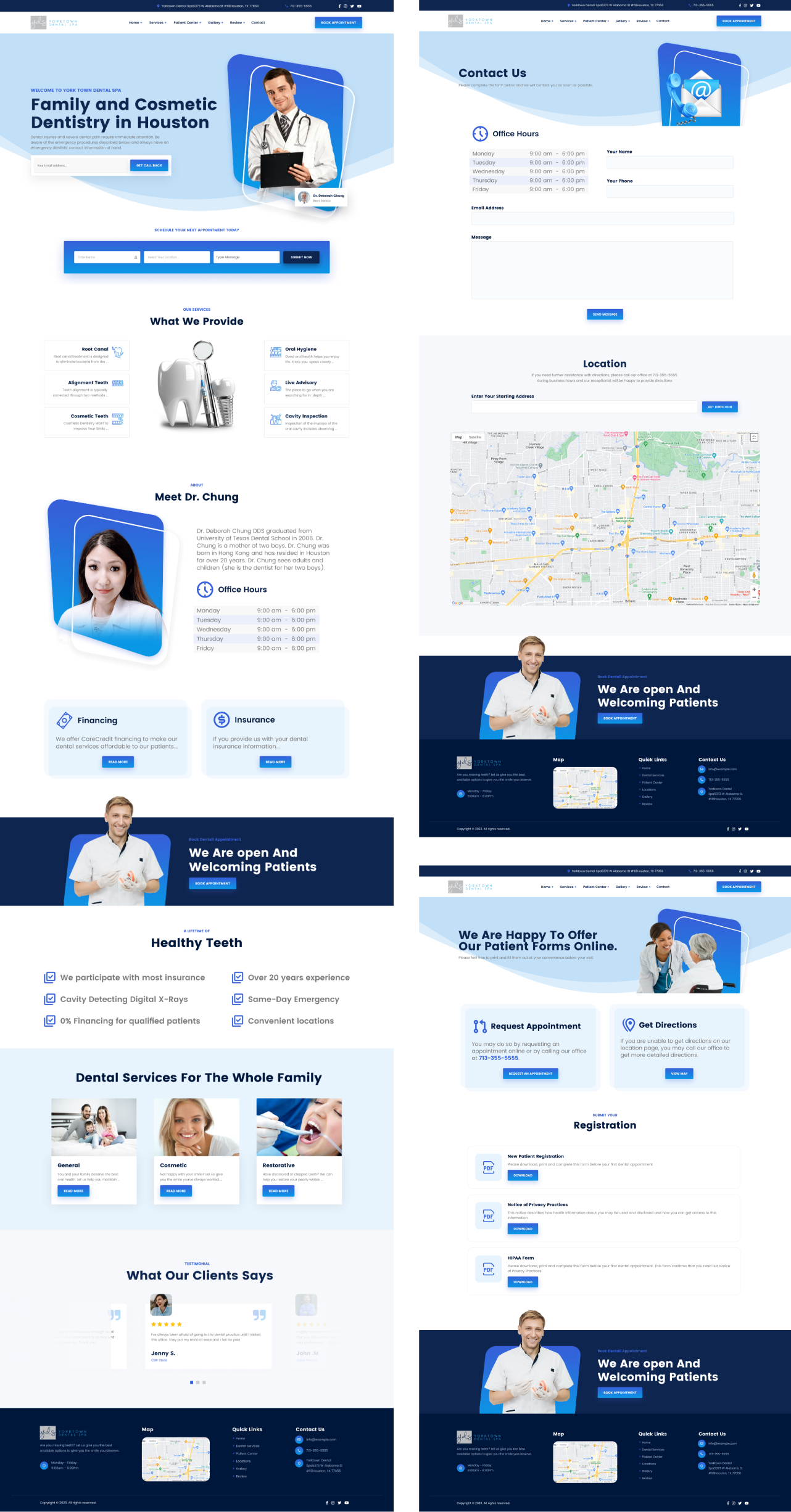
Harness primary colors, especially red and blue, with crisp imagery of professionals. Poppins typography stands out against a backdrop of clean white space.
We use primary colors to a modern mix of red and blue, plus all-new photography. We utilized new Sharpe images of professionals, combined with Poppins typography against simple white space.
We use primary colors to a modern mix of red and blue, plus all-new photography. We utilized new Sharpe images of professionals, combined with Poppins typography against simple white space.